Successes
Some brief summaries of projects I've counted as wins. If you'd like to learn more about any of these, get in touch; I'd be happy to talk your ear off.

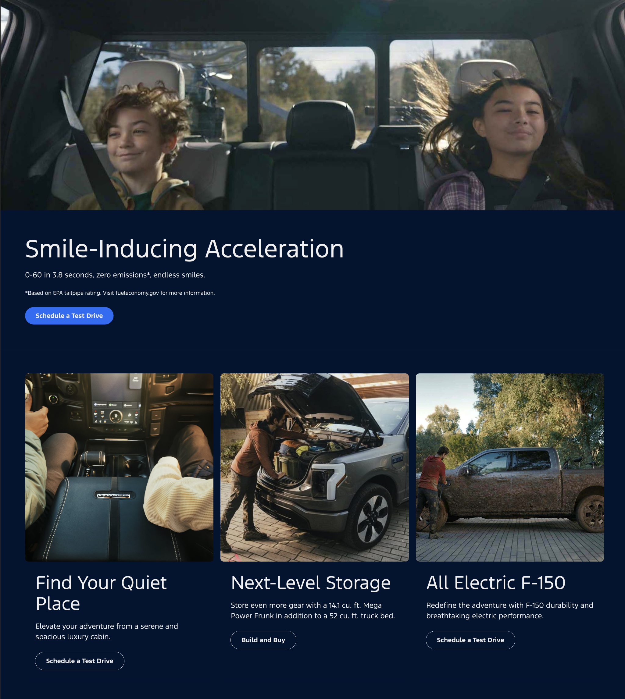
⚡️ F-150 Lightning "Lux Truck" Homepage
(October 2023 - July 2024)

Challenge
How might we target a discrete audience of high-income, outdoorsy, luxury-SUV-oriented potential customers with a variant version of the F-150 Lightning's homepage?
My Role
Design and Content Strategy
Approach
- Understanding how competitors in the luxury adventure SUV space marketed their vehicles with competitive analysis
- Collaborating with the marketing team to understand any existing research they had in this space, and feeding what we learned back to them
- Defining and refining the core value proposition of the Lightning to this particular audience
- Auditing our available imagery to identify gaps and specifying what we would need from an upcoming ad agency photo/commerical shoot in order to populate this page
- Selecting images from the new creative and working with writers and legal to draft new copy
Outcomes
- The variant homepage was A/B tested alongside the default homepage and saw a statistically significant increase in conversion to the Test Drive and Built & Buy workflows
⬆️ Back to Top
⛽️ Circle K DesignOps
(January 2022 - November 2022)

Challenge
How can we unify the customer experiences across the convenience store brand's various digital services and programs when each is developed by different third parties and there is no in-house design team?
My Role
UX Designer, Design Systems, Researcher, Design Recruitment, Managing Design Team
Approach
- Designing a centralized enrollment flow used for the loyalty app, beverage subscription service, and rewards debit card program
- Enhancing the design system and evangelizing it to 3rd party development teams and internal stakeholders
- Interviewing candidates for an in-house Design Manager role
- Iterative usability testing
Outcomes
- Circle K hired two of my recommended candidates, who eventually took ownership of our design work
- Several redesigned products shipped and saw increased conversion rates
- Measurably increased the organization's design maturity
⬆️ Back to Top
🩺 Epic Design System
(2016 - 2021)

Challenge
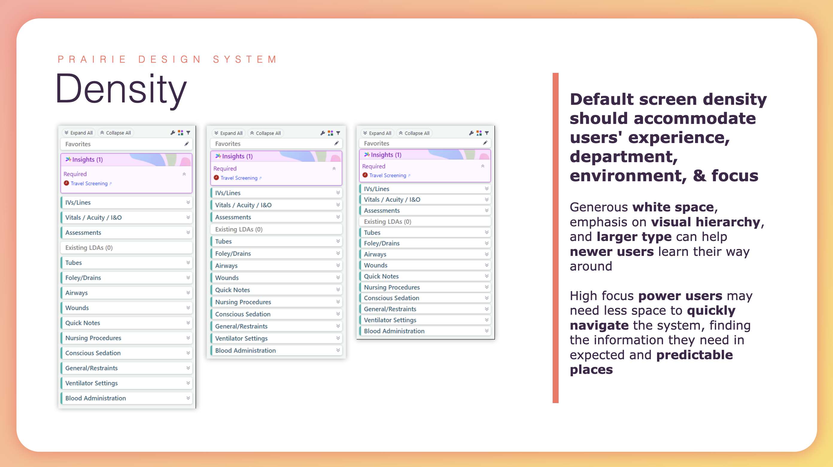
The design team was given a directive from leadership to unify and modernize the UI of a sprawling, decades-old, multi-platform piece of software, and enforce the unified standards on all new development going forward.
My Role
Lead developer for the design system site and iterative prototyping framework, and writer of large portions of the documentation itself. Later, product owner of the design system.
Approach
- Designing the actual standards by creating an HTML/CSS prototyping framework that could mimic common system styles, prototyping some of the software's most complex, common, and high-stakes screens in it, then iteratively and collaboratively redesigning core components using those screens as a testing sandbox
- Once core styles were agreed upon, documenting them in detail within the design system site
- Carving out exceptions for technologies where the optimal styling was not possible
- Messaging these new standards, and the existence of the design system to the 1000+ developers who would be using them across the company
- Designing processes for change management and the incorporation of new controls into the system
Outcomes
The new design system rolled out within a year, and most common screens were heavily modified by it. Several common components received huge improvements in usability and accessibility as a result, and the design system was key in a later migration from older technologies to a modern one.
Also, it made a lot of our users very upset. For more about that, read the corresponding section in the Failures part of my portfolio.
⬆️ Back to Top
👁️ Icon Town
(March 2017 - July 2017)

Challenge
How could we made an enterprise icon library containing more than 3,000 distinct shapes and 50,000 image assets easy to navigate, search, and organize for both our customers and our coworkers?
My Role
Leading a team of designers wearing multiple hats to design the governance process, database architecture, and UI. Afterwards, developing the front end of the application and working to maintain the library long-term.
Approach
We started by digging into the icon-related problems our customers were struggling with, what developers needed to know to use icons correctly, what designers needed to be able to organize them, and what all three needed in order to find the right icon. We also learned more about the technical details of how the icon library existed in the software. The final product prioritized grouping image assets that shared the same meaning, being able to tag and search every kind of content, being able to show changes to an icon over time, and being able to recommend which assets were the best to use.
Above all, it was a reliable source of truth that was synchronized programmatiaclly with real development, so it was always accurate and up-to-date.
Outcomes
Icon Town continues to be used extensively by Epic employees and our customers. For designers, it's an easy way to find source assets for mockups, and for customers, it makes customization involving icons much simpler.
⬆️ Back to Top
📖 Storyboard
(2017 - July 2019)

Challenge
As monitor sizes and dimensions change, how could we use space more effectively and display content that would be valuable for users to see and interact with wherever they are in a patient's chart?
My Role
Working with a team of designers and developers to create and communicate principles, design UI, and develop change management strategies for a drastic holistic change to enterprise software.
Approach
This project required a multi-pronged UX approach—not only ensuring that it was intuitive and easy to use, but also making sure that the content and behavior for many Storyboards across all our applications behaved consistently and predictably. We tested it extensively, conducting more than 1,000 usability tests over the course of a few years. Messaging the "why" behind the project to our customers and users was also critical to ensure user adoption, and in addition to presenting about it frequently at Epic-hosted events, we piloted Storyboard at five customer organizations.
Outcomes
All of our customers are now live on the Storyboard. Adoption was extremely quiet and easy for a change of this scope and size. New Storyboards continue to be designed and the core infrastructure enhanced.
⬆️ Back to Top
🔑 Sijilli
(January 2018 - April 2018)

Challenge
How can healthcare organizations working in refugee camps establish medical records for an ever-changing population that will continue to support refugees' care even after they move to another location?
My Role
Designing and rapid-prototyping the user interface of the application alongside a team of developers and QA testers.
Approach
I focused on creating a UI that would require no training or knowledge of other electronic health records, prioritizing form usability across both laptop and tablet form factors.
Outcomes
As of February 2019, over 6,500 Syrian refugees had a Sijilli record.
⬆️ Back to Top